Before you can analyze data, you need to read it. The MCAT loves to bury key information inside graphs and tables, then ask you to draw conclusions under time pressure. Think of each figure like a map - if you know where to look and what the symbols mean, you can navigate quickly. If you do not, you will waste precious minutes squinting at axes and legends.
This section covers every data format you will encounter on test day, along with the visual traps the MCAT uses to mislead careless readers.
Tables
Tables are the simplest way to present data - rows and columns of numbers. On the MCAT, tables typically present raw experimental results, patient characteristics, or comparison data between groups.
When reading a table, scan for the largest and smallest values, any obvious patterns (does a value consistently increase down the rows?), and any unexpected outliers. The MCAT rarely asks you to perform complex calculations from a table - it tests whether you can identify trends and make comparisons.
Bar Graphs
Bar graphs compare discrete categories. Each bar represents a different group, and the height shows the measured value. They are ideal for comparing things like average blood pressure across treatment groups or survey responses across age brackets.
Key details to check: Are error bars included? Do the bars start at zero? Are the groups meaningfully different, or do the error bars overlap?
Histograms
Histograms look like bar graphs but represent something fundamentally different. Instead of comparing categories, histograms show the distribution of a single continuous variable. Each bar covers a range of values (a “bin”), and the height shows how many data points fall in that range.
For example, a histogram of exam scores might have bins of 60-70, 70-80, 80-90, and 90-100. The tallest bar tells you where most scores cluster.
Line Graphs
Line graphs display how a variable changes over a continuous range, usually time. Points are connected by lines to show trends. They are the go-to format for showing how a measurement changes during an experiment (drug concentration over hours, population growth over years, reaction rate over temperature).
When interpreting line graphs, focus on: the overall trend (increasing, decreasing, or flat), the slope (steep = rapid change, flat = slow change), and any inflection points where the trend reverses.
Scatter Plots
Scatter plots show the relationship between two continuous variables. Each point represents one observation, plotted by its x-value and y-value. They are used to visualize correlations.
Look for: an upward trend (positive correlation), a downward trend (negative correlation), or a random cloud (no correlation). If a best-fit line is drawn, note its slope and how tightly the points cluster around it.
Pie Charts
Pie charts show proportions of a whole. Each slice represents the fraction of the total belonging to a category. They are less common on the MCAT than other graph types but may appear in passages about demographics, budget allocations, or causes of disease.
The key limitation: pie charts make it hard to compare similar-sized slices. If two slices look nearly the same, you need the actual percentages to tell them apart.
Common MCAT Graph Traps
The MCAT test-writers are skilled at presenting data in ways that can mislead a rushed reader. Watch for these tricks.
Truncated Y-Axis
The y-axis does not start at zero. A bar graph showing values of 98, 100, and 102 looks like a big difference if the y-axis runs from 97 to 103. In reality, the differences are tiny. Always check where the axis starts.
Misleading Scales
One axis uses a logarithmic scale while the other uses a linear scale. A straight line on a log-linear graph actually represents exponential growth, not linear growth. Check axis labels carefully.
Dual Y-Axes
Two different variables are plotted on the same graph, each with its own y-axis (one on the left, one on the right). This can create the illusion of a relationship between variables that are actually on completely different scales.
Unlabeled or Mislabeled Axes
Always confirm what each axis measures and what units are used. A graph showing drug concentration in mg/L tells a very different story than one showing concentration in g/L.
What is the key difference between a bar graph and a histogram?
Click to reveal answer
A bar graph compares discrete categories (e.g., treatment groups), while a histogram shows the distribution of a continuous variable across numerical ranges (bins). In a bar graph, the bars are separated by gaps. In a histogram, the bars are adjacent because they represent continuous ranges.
A bar graph shows drug efficacy for three groups, but the y-axis starts at 85% instead of 0%. Why is this misleading?
Click to reveal answer
A truncated y-axis exaggerates visual differences between bars. A difference between 87% and 92% efficacy looks enormous when the axis runs from 85% to 95%, but it is actually only a 5 percentage point difference. Always check the starting point of the y-axis before judging the magnitude of a difference.
Imagine you are trying to describe the “typical” income in a neighborhood. You could average everyone’s salary, find the middle salary, or identify the most common salary. Each approach gives a different answer, and each tells a different story. Central tendency is about summarizing a dataset with a single representative number - but choosing the wrong measure can be seriously misleading.
Mean (Average)
The mean is the sum of all values divided by the number of values. It is the most commonly used measure of central tendency.
Mean = (sum of all values) / n
The mean uses every data point in the calculation, which makes it powerful but also makes it vulnerable. A single extreme value can drag the mean far from where most of the data actually lives.
Median
The median is the middle value when all data points are arranged in order. If there is an even number of values, the median is the average of the two middle values.
The median is resistant to outliers. No matter how extreme the highest or lowest value is, the median stays anchored in the center of the data. This makes it the preferred measure for skewed distributions.
Mode
The mode is the most frequently occurring value in a dataset. A dataset can have one mode (unimodal), two modes (bimodal), or more (multimodal). If no value repeats, there is no mode.
The mode is the only measure of central tendency that works for categorical data. You cannot calculate the mean or median of eye colors, but you can find the most common eye color (the mode).
Symmetric vs. Skewed Distributions
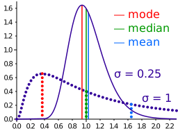
The positions of mean, median, and mode in symmetric and skewed distributions. In a symmetric distribution, all three coincide. In a right-skewed distribution, the mean is pulled toward the right tail (mean > median > mode). In a left-skewed distribution, the mean is pulled toward the left tail (mean < median < mode). Credit: Wikimedia Commons, CC BY-SA 3.0
The relationship between mean, median, and mode tells you about the shape of a distribution.
Symmetric distribution: Mean = Median = Mode. The data is balanced around the center. A bell curve is the classic example.
Right-skewed (positive skew): Mean > Median > Mode. A long tail stretches to the right, pulling the mean in that direction. Example: household income in most countries.
Left-skewed (negative skew): Mean < Median < Mode. A long tail stretches to the left, pulling the mean down. Example: age at retirement (most people retire around 65, but a few retire very young).
Visualizing the Order
For a right-skewed distribution, picture the values along a number line from left to right:
Mode - Median - Mean (mean pulled right toward the tail)
For a left-skewed distribution:
Mean - Median - Mode (mean pulled left toward the tail)
When to Use Each Measure
Situation
Best Measure
Why
Symmetric, no outliers
Mean
Uses all data, most informative
Skewed data
Median
Not affected by extreme values
Outliers present
Median
Resistant to being pulled by extremes
Categorical data
Mode
Only option for non-numeric data
Bimodal data
Mode(s)
Reveals that data has two clusters
In a right-skewed distribution, what is the order of mean, median, and mode from lowest to highest?
Click to reveal answer
Mode < Median < Mean. The long right tail pulls the mean to the highest value. The mode sits at the peak (lowest of the three), and the median falls between them. Remember: the mean always chases the tail.
A researcher reports that the mean blood pressure in a study is 180 mmHg while the median is 125 mmHg. What does this tell you about the distribution?
Click to reveal answer
The distribution is right-skewed. The mean (180) is much higher than the median (125), which means the data has a long right tail - likely a few patients with extremely high blood pressure pulling the mean up. The median (125 mmHg) is a better representation of the "typical" patient in this dataset.
Knowing the center of your data is only half the story. Two classes can both have a mean exam score of 75%, yet tell completely different stories. In one class, every student scored between 70% and 80%. In the other, scores ranged from 30% to 100%. The averages are identical, but the experiences are worlds apart. Variability - how spread out the data is - gives you the other half of the picture.
Range
The range is the simplest measure of spread: the difference between the maximum and minimum values.
Range = Maximum - Minimum
It is easy to calculate but very crude. A single outlier can blow up the range. If 99 students score between 70 and 80 and one student scores 15, the range jumps from 10 to 65 - even though almost all the data is tightly clustered.
Variance
Variance measures how far each data point is from the mean, on average. The calculation involves three steps:
Find the mean of the dataset.
Subtract the mean from each data point to get the deviation. Square each deviation.
Average the squared deviations.
Variance (s²) = Σ(x−xˉ)2 / (n - 1) for a sample
Why square the deviations? Because raw deviations (positive and negative) cancel each other out and always sum to zero. Squaring ensures all deviations are positive.
The catch: because we squared the deviations, the units of variance are squared too. If your data is in centimeters, the variance is in cm². That makes variance hard to interpret directly, which is why we usually take one more step.
Standard Deviation
Standard deviation (SD or s) is simply the square root of the variance. This brings the units back to match the original data.
Standard deviation = sqrt(variance)
What Standard Deviation Tells You
Think of SD as a “typical distance from the mean.” If the mean height in a class is 170 cm with SD = 5 cm, most students are within about 5 cm of 170 cm. If SD = 15 cm, heights are much more spread out.
Why n - 1?
You may notice the sample variance formula divides by (n - 1) instead of n. This is called Bessel’s correction. A sample tends to underestimate the true population variance because sample data points cluster closer to the sample mean than to the true population mean. Dividing by (n - 1) slightly inflates the estimate to correct for this bias. For the MCAT, just know that sample variance uses (n - 1) and population variance uses N.
Interquartile Range (IQR)
The interquartile range is the range of the middle 50% of the data. It is calculated by finding the first quartile (Q1, the 25th percentile) and third quartile (Q3, the 75th percentile), then subtracting.
IQR = Q3 - Q1
Like the median, the IQR is resistant to outliers. It ignores the top 25% and bottom 25% of the data entirely, focusing only on the central bulk. This makes it the go-to measure of spread for skewed distributions.
Comparing Measures of Variability
Measure
Formula
Strengths
Weaknesses
Range
Max - Min
Simple, quick
Sensitive to outliers
Variance
Avg of squared deviations
Uses all data
Units are squared
SD
sqrt(variance)
Same units as data, uses all data
Sensitive to outliers
IQR
Q3 - Q1
Resistant to outliers
Ignores 50% of data
Two datasets have the same mean of 50. Dataset A has SD = 3 and Dataset B has SD = 12. What does this tell you?
Click to reveal answer
Dataset B is much more spread out than Dataset A. In Dataset A, most values cluster within about 3 units of the mean (roughly 47 to 53). In Dataset B, values are spread over about 12 units from the mean (roughly 38 to 62). The means are identical, but the variability is very different.
Why is IQR preferred over range as a measure of variability for skewed data?
Click to reveal answer
The IQR is resistant to outliers because it only uses the middle 50% of data (Q1 to Q3). The range uses only the maximum and minimum values, which can be heavily influenced by a single extreme outlier. In skewed distributions, the tails contain extreme values that inflate the range but do not affect the IQR.
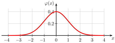
Your professor announces that the exam will be “graded on a curve.” What does that actually mean? It means the raw scores will be mapped onto a normal distribution - the famous bell-shaped curve where most students cluster around the average and fewer students appear at the extremes. This single shape turns up everywhere: heights of adults, blood pressure readings, measurement errors in a lab, IQ scores. Understanding its properties is essential for nearly every statistics question on the MCAT.
What Makes a Distribution “Normal”?
A normal distribution has several defining features:
Bell-shaped and symmetric around the mean. The left half is a mirror image of the right half.
Mean = Median = Mode. All three measures of central tendency sit at the center.
Tails extend infinitely in both directions but never touch the x-axis. Extreme values are possible but increasingly rare.
Completely defined by two numbers: the mean (which sets the center) and the standard deviation (which sets the width).
The 68-95-99.7 Rule (Empirical Rule)
The normal distribution (bell curve) with the 68-95-99.7 empirical rule. About 68% of data falls within 1 SD of the mean, 95% within 2 SDs, and 99.7% within 3 SDs. The symmetry of the curve means equal percentages fall in each tail beyond any given SD boundary. Credit: Wikimedia Commons, CC BY-SA 3.0
This is the single most important fact about the normal distribution for the MCAT. Memorize it cold.
68% of data falls within 1 SD of the mean (between -1 SD and +1 SD)
95% of data falls within 2 SDs of the mean (between -2 SD and +2 SD)
99.7% of data falls within 3 SDs of the mean (between -3 SD and +3 SD)
Worked Example
Suppose IQ scores follow a normal distribution with mean = 100 and SD = 15.
68% of people have IQs between 85 and 115 (100 +/- 15)
95% of people have IQs between 70 and 130 (100 +/- 30)
99.7% of people have IQs between 55 and 145 (100 +/- 45)
An IQ of 130 is exactly 2 SDs above the mean. Since 95% of the data falls within 2 SDs, only 5% falls outside this range. Because the distribution is symmetric, 2.5% falls above 130 and 2.5% falls below 70.
Tail Percentages Quick Reference
Range
% Inside
% Outside (both tails)
% in one tail
Within 1 SD
68%
32%
16%
Within 2 SDs
95%
5%
2.5%
Within 3 SDs
99.7%
0.3%
0.15%
Shifting and Stretching the Curve
Changing the mean shifts the entire bell curve left or right along the number line without changing its shape. Changing the SD changes the width: a larger SD makes the curve wider and flatter, while a smaller SD makes it taller and narrower. The total area under the curve is always 1 (representing 100% of the data), so a wider curve must be shorter to compensate.
In a normal distribution with mean = 50 and SD = 10, what percentage of data falls between 30 and 70?
Click to reveal answer
95%. The value 30 is 2 SDs below the mean (50 - 20 = 30) and 70 is 2 SDs above the mean (50 + 20 = 70). By the 68-95-99.7 rule, 95% of data in a normal distribution falls within 2 SDs of the mean.
If 68% of data falls within 1 SD of the mean, what percentage falls above 1 SD above the mean?
Click to reveal answer
16%. If 68% is within 1 SD, then 32% is outside (in both tails combined). Since the normal distribution is symmetric, each tail contains half: 32% / 2 = 16%. So 16% of data falls more than 1 SD above the mean.
You scored 720 on the biology section and 510 on the psychology section. Which performance was better? You cannot compare raw scores directly because the two sections have different means and different spreads. You need a common yardstick - a way to say “how far above or below average was this score, relative to everyone else?” That yardstick is the z-score.
The Z-Score Formula
A z-score tells you how many standard deviations a data point is above or below the mean.
z = (x - μ) / σ
where x is the individual value, μ is the population mean, and σ is the standard deviation.
Interpreting Z-Scores
z = 0: The value equals the mean. Perfectly average.
z = +1: The value is 1 SD above the mean.
z = +2: The value is 2 SDs above the mean.
z = -1: The value is 1 SD below the mean.
z = -1.5: The value is 1.5 SDs below the mean.
Positive z-scores are above average. Negative z-scores are below average. The magnitude tells you how far from average.
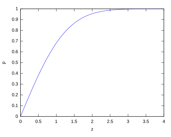
Z-Scores to Percentiles
By combining z-scores with the 68-95-99.7 rule, you can quickly estimate percentiles.
Z-Score
Percentile
Reasoning
-3
0.15th
99.7% is below +3 SD; 0.15% is below -3 SD
-2
2.5th
95% is within 2 SD; 2.5% is below -2 SD
-1
16th
68% within 1 SD; 16% below -1 SD
0
50th
The mean is the midpoint
+1
84th
50% + half of 68% = 50% + 34% = 84%
+2
97.5th
50% + half of 95% = 50% + 47.5% = 97.5%
+3
99.85th
50% + half of 99.7% = 50% + 49.85%
Worked Example
A medical school class has a mean Step 1 score of 230 with SD = 20. A student scored 270.
z = (270 - 230) / 20 = 40 / 20 = 2
This student is exactly 2 SDs above the mean. From the table above, z = +2 corresponds to the 97.5th percentile. This student scored higher than 97.5% of the class.
Comparing Across Different Scales
Z-scores let you compare values from completely different distributions. Suppose:
Biology exam: your score = 82, mean = 75, SD = 5. Your z = (82 - 75)/5 = 1.4
Chemistry exam: your score = 68, mean = 60, SD = 4. Your z = (68 - 60)/4 = 2.0
Even though your raw biology score (82) was higher, your chemistry performance (z = 2.0) was relatively better compared to the class. You were further above average in chemistry.
A data point has a z-score of -1.0. What percentile is it at, approximately?
Click to reveal answer
Approximately the 16th percentile. A z-score of -1 means the value is 1 SD below the mean. Since 68% of data falls within 1 SD, 32% is outside, and 16% is below -1 SD. This person scored higher than only about 16% of the population.
Population A has mean = 100 and SD = 10. Population B has mean = 500 and SD = 100. A value of 120 from Population A and a value of 700 from Population B - which is more extreme?
Click to reveal answer
The value of 120 from Population A is equally extreme as 700 from Population B. For Population A: z = (120 - 100)/10 = 2.0. For Population B: z = (700 - 500)/100 = 2.0. Both are exactly 2 SDs above their respective means - they are equally extreme despite the very different raw values.
You read that a new drug lowers blood pressure by 8 mmHg, with a 95% confidence interval of 5 to 11 mmHg. What does that actually tell you? Is it just a fancy way of saying “somewhere between 5 and 11”? Not exactly. Confidence intervals are one of the most commonly misinterpreted concepts in all of statistics, and the MCAT knows it. Getting the interpretation right - and understanding the common wrong interpretation - is a high-yield skill.
What Is a Confidence Interval?
A confidence interval (CI) is a range of values that is likely to contain the true population parameter. When researchers report a result, they are working with a sample, not the entire population. The CI acknowledges that the sample estimate is imprecise and provides a range.
Visualizing 95% confidence intervals. Each horizontal bar represents a CI from a different sample. About 95% of the intervals capture the true population parameter (vertical line), while about 5% miss it. The 95% refers to the long-run success rate of the method, not the probability for any single interval. Credit: Wikimedia Commons, CC BY-SA 3.0
The Correct Interpretation
“If we repeated this experiment many times, 95% of the resulting confidence intervals would contain the true population parameter.”
This is a statement about the procedure, not about any single interval. Once a CI is calculated (say, 5 to 11 mmHg), the true value either is or is not in that range - we just do not know which.
What Affects the Width of a CI?
A narrow CI means high precision. A wide CI means low precision. Three factors control the width:
1. Sample Size
Larger samples produce narrower CIs. This is the most important factor. Doubling the sample size does not halve the CI width (it shrinks by a factor of sqrt(2)), but increasing sample size always improves precision.
2. Variability (SD)
More variable data produces wider CIs. If individual measurements scatter widely, the estimate of the mean is less precise.
3. Confidence Level
A higher confidence level (e.g., 99% vs. 95%) produces a wider CI. Wanting to be more confident that you caught the true value requires casting a wider net. A 99% CI is always wider than a 95% CI from the same data.
CIs and Statistical Significance
Confidence intervals provide an elegant way to assess statistical significance without even looking at a p-value.
If a 95% CI for a difference between two groups does NOT include zero, the difference is statistically significant at p < 0.05.
If the 95% CI DOES include zero, the difference is NOT statistically significant at the 0.05 level.
Why? If the CI for a treatment effect includes zero, then “no effect” is a plausible value. You cannot rule out the possibility that the true effect is zero.
Overlapping CIs Between Groups
When comparing two groups, if their individual 95% CIs do not overlap at all, the difference is definitely significant. However, if the CIs do overlap slightly, the difference might still be significant - overlapping CIs is not the same as a non-significant difference. The proper test is to look at the CI of the difference, not the overlap of individual CIs.
A study reports a mean difference of 4.2 points with a 95% CI of (-0.8 to 9.2). Is this result statistically significant at p < 0.05?
Click to reveal answer
No, it is not statistically significant. The 95% CI includes zero (-0.8 to 9.2), which means "no difference" is a plausible value. We cannot reject the null hypothesis at the 0.05 significance level. The true difference could be anywhere from -0.8 to 9.2, and zero falls within that range.
A researcher wants to narrow the confidence interval of a study. What is the most effective change they can make?
Click to reveal answer
Increase the sample size. A larger sample reduces the standard error (SEM = SD / sqrt(n)), which directly narrows the confidence interval. Other options include reducing measurement variability (harder to control) or lowering the confidence level from 99% to 95% (which reduces certainty). Increasing sample size is almost always the most practical and effective approach.
A pharmaceutical company claims their new drug lowers cholesterol. A skeptic says it does nothing. How do you settle the debate with data? You cannot just eyeball a graph and declare a winner. You need a formal framework - a set of rules that everyone agrees on before the experiment starts - that tells you when the evidence is strong enough to side with the company over the skeptic. That framework is hypothesis testing, and it is the backbone of every research study you will encounter on the MCAT.
The Jury Trial Analogy
Hypothesis testing works exactly like a criminal trial.
The Null Hypothesis (H-null)
The null hypothesis (H0) is the default assumption: there is no effect, no difference, no relationship. It represents the skeptic’s position.
Examples:
“The drug has no effect on cholesterol.” (H0: μ-drug = μ-placebo)
“There is no difference in test scores between the two teaching methods.”
“There is no correlation between sleep and GPA.”
The null hypothesis always contains an equals sign. It claims nothing interesting is happening.
The Alternative Hypothesis (H1 or Hₐ)
The alternative hypothesis is the researcher’s claim: there IS an effect, a difference, or a relationship. It is what you are trying to find evidence for.
Examples:
“The drug lowers cholesterol.” (H1: μ-drug < μ-placebo)
“The two teaching methods produce different test scores.”
“There is a correlation between sleep and GPA.”
The Steps of Hypothesis Testing
State hypotheses. Define H0 (no effect) and H1 (there is an effect).
Set the significance level (α). By convention, α = 0.05. This is the threshold for “strong enough evidence.”
Collect data and calculate a test statistic. The test statistic measures how far the sample result is from what H0 predicts.
Find the p-value. The probability of getting a result this extreme (or more extreme) if H0 is true.
Make a decision. If p < α, reject H0. If p >= α, fail to reject H0.
”Reject” vs. “Fail to Reject”
This language is deliberate and the MCAT tests it.
Reject H0: The evidence is strong enough to conclude that the null hypothesis is unlikely. The result is “statistically significant.”
Fail to reject H0: The evidence is not strong enough to rule out the null hypothesis. This does NOT mean H0 is true - it means you do not have enough evidence to reject it.
One-Tailed vs. Two-Tailed Tests
A two-tailed test checks for a difference in either direction. H1: the drug changes cholesterol (could go up or down). The α is split between both tails (0.025 in each tail for α = 0.05).
A one-tailed test checks for a difference in a specific direction. H1: the drug lowers cholesterol. All of α (0.05) is in one tail, making it easier to achieve significance in that direction.
A researcher reports p = 0.12 for a study comparing two treatments. What is the correct conclusion?
Click to reveal answer
Fail to reject the null hypothesis. Since p = 0.12 is greater than the standard α of 0.05, the evidence is not strong enough to conclude that the treatments differ. This does NOT mean the treatments are the same - it means we do not have sufficient evidence to say they are different.
Why is it incorrect to say "we accept the null hypothesis"?
Click to reveal answer
Because failing to reject H0 does not prove H0 is true. It only means the evidence was not strong enough to reject it. The study may have lacked statistical power (too few participants, too much variability) to detect a real effect. Absence of evidence is not evidence of absence. The correct language is always "fail to reject H0."
The p-value might be the single most misunderstood number in all of science. Researchers misinterpret it. Journalists butcher it. Even some textbooks get it wrong. The MCAT knows this, and it will test whether you understand what a p-value actually means - and more importantly, what it does not mean. Get this concept right and you have a major advantage on test day.
The Definition
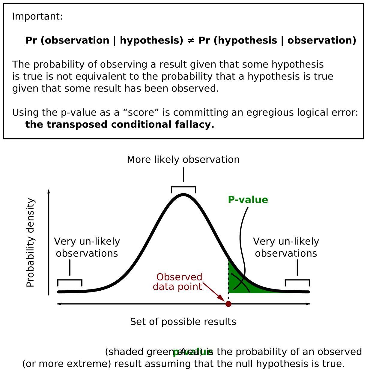
A p-value is the probability of obtaining results at least as extreme as the observed results, assuming the null hypothesis is true.
Read that again slowly. The p-value does not tell you the probability that the null hypothesis is true or false. It tells you how surprising your data would be in a world where the null hypothesis is true.
The p-value represented as the shaded area under the curve beyond the observed test statistic. A smaller shaded area (smaller p-value) means the observed result is more extreme and less likely under the null hypothesis, providing stronger evidence against H-null. Credit: Wikimedia Commons, CC BY-SA 3.0
The 0.05 Threshold
By convention, a p-value less than 0.05 is considered “statistically significant.” This means:
p < 0.05: The result is unlikely enough under H0 that we reject the null hypothesis. “Statistically significant.”
p >= 0.05: The result is not surprising enough under H0 to reject it. “Not statistically significant.”
The 0.05 cutoff is a convention, not a law of nature. Some fields use stricter thresholds (particle physics uses p < 0.0000003). The MCAT almost always uses 0.05 unless stated otherwise.
What the P-Value is NOT
These misconceptions appear as trap answer choices on the MCAT.
Misconception 1: “The p-value is the probability that H0 is true.”
Wrong. The p-value assumes H0 is true and then asks how likely the data is. It does not give you the probability that H0 is true or false.
Misconception 2: “p = 0.03 means there is a 3% chance the result is due to chance.”
Wrong. The p-value is the probability of seeing data this extreme if H0 is true, not the probability that the result is a fluke.
Misconception 3: “A smaller p-value means a larger effect.”
Wrong. A small p-value means the evidence against H0 is strong, but it says nothing about the size of the effect. You can get a tiny p-value from a huge sample even if the actual effect is trivially small.
P-Values and Sample Size
This is a critical nuance the MCAT tests. A large sample size increases the power of a study, making it easier to detect small effects. This means:
A study with 100,000 participants can produce a tiny p-value (say, p = 0.0001) for a completely trivial effect (like a drug that lowers blood pressure by 0.1 mmHg).
A study with 15 participants might produce a large p-value (say, p = 0.15) even if the drug works, simply because the sample was too small to detect the effect reliably.
P-Values in MCAT Passages
Research passages will often state something like: “The difference between groups was significant (p = 0.03)” or “No significant difference was found (p = 0.42).” When you see this, you should be able to:
Determine whether H0 was rejected (p < 0.05) or not (p >= 0.05).
Understand that this is not the probability that the null is true.
Consider whether the sample size might be influencing the result.
A study finds p = 0.03. A student says, "There is a 3% probability that the null hypothesis is true." Is this correct?
Click to reveal answer
No, this is incorrect. The p-value is the probability of obtaining data this extreme (or more extreme) assuming H0 is true. It is NOT the probability that H0 is true. The correct interpretation: "If H0 were true, there is a 3% chance of observing results at least this extreme." This distinction is one of the most commonly tested statistical misconceptions on the MCAT.
Study A (n = 50) finds a 10-point improvement with p = 0.04. Study B (n = 50,000) finds a 0.5-point improvement with p = 0.001. Which study has more clinically meaningful results?
Click to reveal answer
Study A has more clinically meaningful results. Even though Study B has a smaller p-value (stronger evidence against H0), its effect size is tiny (0.5 points). Study A found a 10-point improvement, which is far more likely to matter in practice. Study B achieved its small p-value primarily through its massive sample size, not through a large effect. This illustrates why p-values alone are insufficient - you must also consider effect size.
Every time you make a decision based on data, there are exactly two ways to be wrong. You can sound the alarm when there is no danger, or you can stay silent when the building is on fire. In statistics, these are called Type I and Type II errors, and the MCAT absolutely loves testing them. The good news: once you learn the fire alarm analogy, you will never confuse them again.
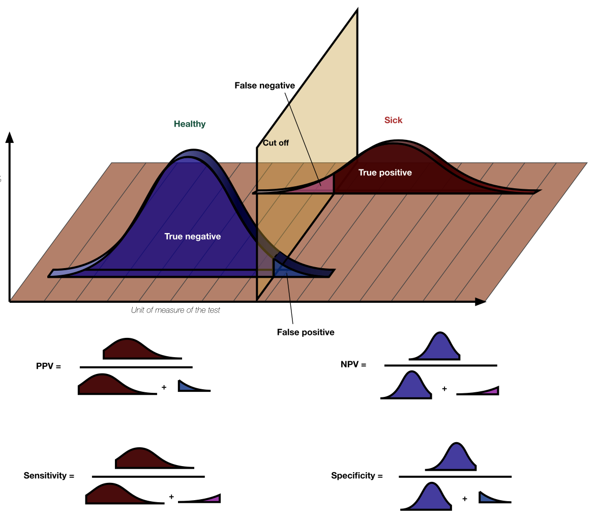
Type I Error (False Positive)
A Type I error occurs when you reject the null hypothesis even though it is actually true. You concluded there was an effect when there really was not one.
Type I = False Positive = “Seeing something that is not there”
The probability of a Type I error is α, which is the significance level you set before the experiment. If α = 0.05, you accept a 5% risk of a Type I error.
Type II Error (False Negative)
A Type II error occurs when you fail to reject the null hypothesis even though it is actually false. You missed a real effect.
Type II = False Negative = “Missing something that IS there”
The probability of a Type II error is β. Unlike α, β is not directly chosen by the researcher - it depends on sample size, effect size, and variability.
The Error Table
The four possible outcomes of hypothesis testing. A Type I error (false positive) occurs when a true null hypothesis is rejected. A Type II error (false negative) occurs when a false null hypothesis is not rejected. Alpha controls the Type I error rate; power (1 - β) is the probability of avoiding a Type II error. Credit: Wikimedia Commons, CC BY-SA 4.0
H0 is True (No Effect)
H0 is False (Real Effect)
Reject H0
Type I Error (α) - False Positive
Correct Decision - True Positive
Fail to Reject H0
Correct Decision - True Negative
Type II Error (β) - False Negative
Statistical Power
Power is the probability of correctly rejecting a false null hypothesis - in other words, the probability of detecting a real effect when one exists.
Power = 1 - β
If β (probability of a Type II error) is 0.20, then power = 0.80, meaning there is an 80% chance of detecting a real effect. Most well-designed studies aim for power of at least 0.80.
How to Increase Power
There are four main ways to increase the power of a study:
Increase sample size. More participants means more data, which makes it easier to detect real effects. This is the most common and practical approach.
Increase the effect size. A larger true effect is easier to detect. Researchers cannot usually control this, but choosing a more potent treatment helps.
Decrease variability. Tighter controls and more precise measurements reduce noise, making the signal easier to see.
Increase α. Using α = 0.10 instead of 0.05 makes it easier to reject H0, which increases power but also increases the Type I error rate.
The Trade-Off
Reducing one type of error increases the other, all else being equal.
If you lower α (stricter threshold, e.g., from 0.05 to 0.01), you reduce Type I errors but increase Type II errors. You are less likely to sound a false alarm, but more likely to miss a real fire.
If you raise α (more lenient, e.g., from 0.05 to 0.10), you reduce Type II errors but increase Type I errors. You catch more real effects but also get more false alarms.
The only way to reduce both error types simultaneously is to increase sample size or reduce variability.
A clinical trial concludes that a new drug is effective (rejects H0), but the drug actually has no effect. What type of error occurred?
Click to reveal answer
Type I error (false positive). The null hypothesis (no effect) was actually true, but the researchers rejected it. They concluded the drug works when it does not. The probability of this error is α, which is typically set at 0.05 (5%).
A study with only 12 participants finds no significant difference between treatments (p = 0.18). A colleague says, "The treatments must be equally effective." What is wrong with this conclusion?
Click to reveal answer
The study likely lacked sufficient statistical power. With only 12 participants, the study may have committed a Type II error (false negative) - failing to detect a real difference because the sample was too small. A non-significant p-value does not prove the treatments are equal. It only means the study did not find enough evidence to declare them different. Increasing the sample size would increase power and provide a more reliable answer.
Ice cream sales and drowning deaths are strongly correlated. As ice cream sales go up, drowning deaths go up. Does ice cream cause drowning? Obviously not. Both increase during summer because of hot weather - a third variable that drives both. This is the most important lesson in all of statistics, and it appears on the MCAT more than almost any other statistical concept: correlation does not equal causation.
The Correlation Coefficient (r)
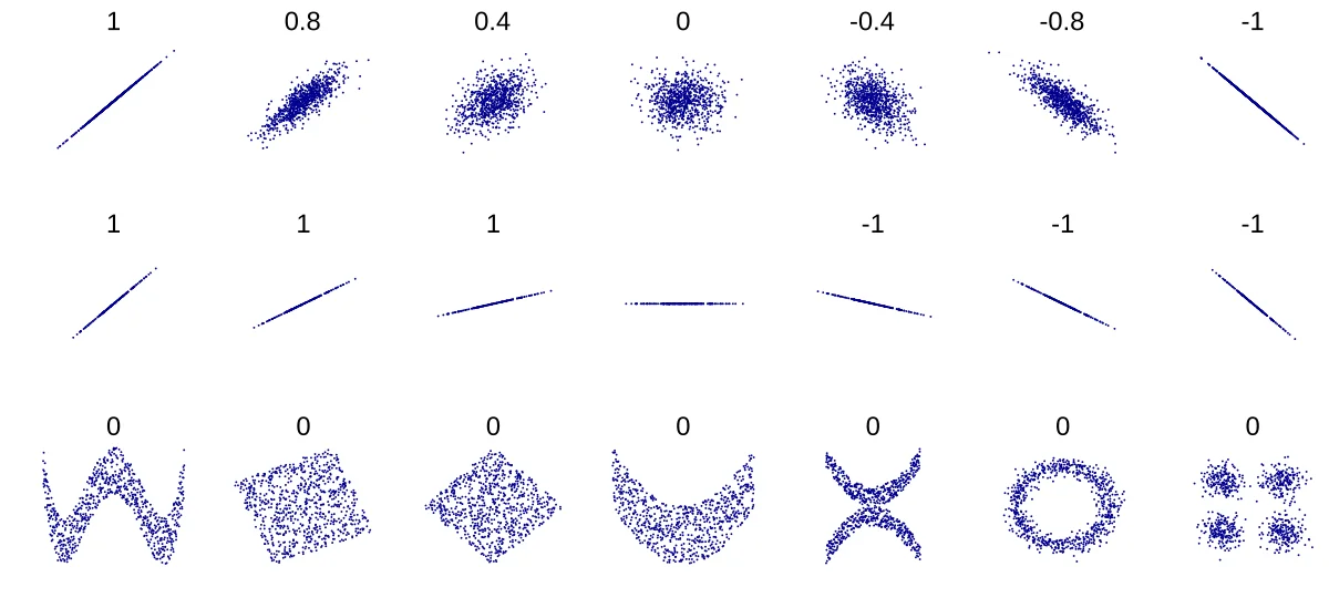
Scatter plots at various correlation strengths. As |r| approaches 1, points cluster more tightly around a line. Positive r means an upward trend; negative r means a downward trend. At r = 0, there is no linear relationship. Remember: strong correlation does not imply causation. Credit: Wikimedia Commons, CC BY-SA 3.0
The correlation coefficient r quantifies the strength and direction of a linear relationship between two variables. It ranges from -1 to +1.
r = +1: Perfect positive correlation. As x increases, y increases in a perfectly linear pattern.
r = -1: Perfect negative correlation. As x increases, y decreases in a perfectly linear pattern.
r = 0: No linear relationship. Knowing x tells you nothing about y.
Values between these extremes indicate the strength of the correlation:
r value
Strength
0.00 to 0.29
Weak
0.30 to 0.69
Moderate
0.70 to 1.00
Strong
The same ranges apply to negative correlations (just add a minus sign).
What r Does NOT Tell You
1. Causation
A strong correlation (even r = 0.95) does not mean x causes y. It only means they move together. They might both be caused by a third variable.
2. Nonlinear Relationships
r measures only linear relationships. Two variables could have a perfect curved relationship (like a parabola) and still have r = 0. If a scatter plot shows a clear U-shape, the correlation coefficient will underestimate the true relationship.
3. Appropriateness for Outliers
A single extreme outlier can sharply inflate or deflate r. Always look at the scatter plot, not just the number.
Correlation vs. Causation: The Three Criteria
For a researcher to claim that A causes B, three conditions must be met:
Correlation exists. A and B must be associated (necessary but not sufficient).
Temporal precedence. A must come before B in time. The cause must precede the effect.
Elimination of alternative explanations. Other variables (confounders) that could explain the relationship must be ruled out. This is why randomized controlled trials are the gold standard - randomization distributes confounders equally between groups.
Confounding Variables (Third Variables)
A confounding variable is a hidden factor that is related to both the independent and dependent variables, creating the illusion of a direct relationship between them.
Shoe size and reading ability in children: Confound = age (older children have bigger feet AND read better).
Number of firefighters at a fire and property damage: Confound = size of fire (bigger fires bring more firefighters AND cause more damage).
Study Types and Causal Claims
Study Type
Can Establish Correlation?
Can Establish Causation?
Case report
No (single observation)
No
Cross-sectional survey
Yes
No (no time order)
Cohort study
Yes
Suggestive but not definitive
Randomized controlled trial
Yes
Yes (strongest evidence)
A study finds a strong positive correlation (r = 0.85) between hours of TV watched and BMI. Can the researchers conclude that watching TV causes weight gain?
Click to reveal answer
No, correlation does not establish causation. Several confounders could explain the relationship: people who watch more TV may also snack more, exercise less, or have lower income (which correlates with both TV time and higher BMI). Without random assignment to "TV watching" and "no TV" groups (which would control for confounders), the study can only establish that the two variables are associated, not that one causes the other.
Two variables show r = 0 on a scatter plot, but the scatter plot reveals a clear U-shaped pattern. Is there a relationship between the variables?
Click to reveal answer
Yes, there is a relationship - but it is nonlinear. The correlation coefficient r only measures linear (straight-line) relationships. A U-shaped (quadratic) relationship will produce r near 0 because the positive and negative slopes cancel out. This is why you should always look at the scatter plot, not just the r value. The variables are clearly related, just not in a linear fashion.
Here is the good news: the MCAT will never ask you to calculate a t-test statistic, run an ANOVA, or perform a chi-square test by hand. But it will absolutely show you a research passage and ask which test the researchers should have used - or whether the test they chose was appropriate. Think of it like knowing which tool to grab from a toolbox without needing to build the tool yourself.
The Decision: What Kind of Data Do You Have?
Choosing the right statistical test comes down to two questions:
What type of data is the outcome? Continuous (numbers on a scale, like blood pressure) or categorical (groups, like “survived” vs. “died”)?
How many groups are being compared?
T-Test: Comparing Means of Two Groups
Use a t-test when you are comparing the average (mean) of a continuous variable between exactly two groups.
Examples:
Does Drug A lower blood pressure more than placebo? (Drug group mean vs. placebo group mean)
Do men and women differ in average resting heart rate?
Is there a difference in exam scores before vs. after a tutoring program? (paired t-test)
There are two main variants:
Independent t-test: Two separate groups (e.g., treatment vs. control).
Paired t-test: The same group measured twice (e.g., before and after treatment).
ANOVA: Comparing Means of Three or More Groups
ANOVA (Analysis of Variance) extends the logic of the t-test to three or more groups. Instead of asking “do these two groups differ?” it asks “do any of these groups differ from any other?”
Examples:
Comparing average recovery time across three treatment protocols.
Testing whether four different diets produce different weight loss.
Comparing exam scores across five study methods.
ANOVA produces a single p-value that tells you whether at least one group differs from the others. It does not tell you which specific groups differ - that requires follow-up tests (post hoc tests).
Use a chi-square test when both your variables are categorical and you are comparing observed frequencies to expected frequencies.
Examples:
Does the ratio of blood types in a sample differ from the expected population ratio?
Is there an association between smoking status (yes/no) and lung cancer (yes/no)?
Does a coin-flip experiment match the expected 5050 distribution?
Chi-square is the test to use when your data is counts in categories, not measurements on a continuous scale.
Correlation and Regression: Relationships Between Continuous Variables
When you want to measure the relationship between two continuous variables (not compare groups), use correlation or regression.
Correlation gives you the r value: the strength and direction of the linear relationship.
Linear regression gives you the equation of the best-fit line (y = mx + b), allowing prediction. It tells you how much y changes for each unit change in x.
Examples:
What is the relationship between study hours and exam scores?
Does increasing drug dose predict blood pressure reduction?
Is there a linear relationship between age and reaction time?
The Decision Table
Question
Outcome Variable
Number of Groups
Test
Do two groups have different means?
Continuous
2
t-test
Do three or more groups have different means?
Continuous
3+
ANOVA
Do observed frequencies match expected?
Categorical
Any
Chi-square
Are two continuous variables related?
Both continuous
N/A
Correlation/Regression
A researcher wants to know if there is a difference in average cholesterol levels among patients taking Drug A, Drug B, Drug C, or placebo. Which statistical test is appropriate?
Click to reveal answer
ANOVA (Analysis of Variance). The study compares the means of a continuous variable (cholesterol level) across four groups (three drugs and placebo). Since there are more than two groups, a t-test is not appropriate. ANOVA tests whether at least one group mean differs from the others while controlling for Type I error.
A genetics experiment crosses two heterozygous organisms and observes offspring phenotypes. The researcher wants to test whether the observed ratio differs from the expected 3:1 ratio. Which test should they use?
Click to reveal answer
Chi-square test. The data is categorical (phenotype counts), and the researcher is comparing observed frequencies to expected frequencies (the predicted 3:1 Mendelian ratio). Chi-square is specifically designed for this type of comparison between observed and expected counts in categorical data.
A new blood pressure drug is tested in 200,000 patients. It lowers systolic blood pressure by 0.5 mmHg compared to placebo, with p = 0.001. The result is statistically significant. Should doctors prescribe it? Absolutely not. A 0.5 mmHg reduction is clinically meaningless - you would not even notice it on a blood pressure cuff. This study perfectly illustrates the most important concept in this entire chapter: statistical significance does not mean the result matters.
Statistical Significance vs. Clinical Significance
Statistical significance (p < 0.05) tells you the result is unlikely to be due to chance alone. It says nothing about the size or importance of the effect.
Clinical significance (or practical significance) asks: is the effect large enough to actually matter in the real world?
Effect Size
Effect size quantifies the magnitude of a difference, independent of sample size. While p-values shrink as sample size grows (even for tiny effects), effect size stays constant.
Cohen’s d
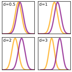
Effect size visualized with Cohen's d. At d = 0.2 (small effect), the two distributions nearly overlap completely. At d = 0.5 (medium), noticeable separation appears. At d = 0.8 (large), the distributions are substantially separated. Effect size captures the practical magnitude of a difference, independent of sample size. Credit: Wikimedia Commons, CC BY-SA 3.0
Cohen’s d is the most commonly referenced effect size measure. It expresses the difference between two group means in units of standard deviations.
d = (Mean1 - Mean2) / pooled SD
Cohen’s benchmarks:
d = 0.2: Small effect
d = 0.5: Medium effect
d = 0.8: Large effect
A drug that lowers blood pressure by 0.5 mmHg when the SD of blood pressure is 15 mmHg has d = 150.5 = 0.03 - a negligibly small effect, no matter how small the p-value.
A therapy that improves depression scores by 8 points on a scale with SD = 10 has d = 0.8 - a large, clinically meaningful effect.
SD vs. SEM: Two Very Different Error Measures
This distinction is tested directly on the MCAT and is crucial for interpreting graphs with error bars.
Standard Deviation (SD)
SD measures the spread of individual data points around the mean. It tells you how variable the raw data is.
SD answers: “How spread out are individual measurements?”
Standard Error of the Mean (SEM)
SEM measures the precision of the sample mean as an estimate of the population mean. It is calculated as:
SEM = SD / sqrt(n)
SEM is always smaller than SD (because you divide by sqrt(n)). As sample size increases, SEM decreases, meaning the estimate of the mean becomes more precise.
SEM answers: “How precisely do we know the true mean?”
Error Bars: Check the Label
Error bars on graphs can represent SD, SEM, or 95% confidence intervals. The interpretation changes a lot depending on which is used.
SD error bars: Show the spread of the data. About 68% of data points fall within one SD bar above and below the mean.
SEM error bars: Show the precision of the mean estimate. They are much smaller than SD bars and can make differences look more impressive.
95% CI error bars: If the error bars of two groups do not overlap, the difference is statistically significant. (Note: slight overlap does not necessarily mean non-significance.)
Putting It All Together
When you encounter a research result on the MCAT, evaluate it on three dimensions:
Statistical significance: Is p < 0.05? If not, the result may be due to chance.
Effect size: Is the difference large enough to matter? Use Cohen’s d benchmarks.
Precision: How wide is the confidence interval? Wide CIs suggest the true effect could be much larger or smaller than reported.
A well-designed, high-quality study has all three: a significant p-value, a meaningful effect size, and a narrow confidence interval.
A study of 500,000 people finds that eating chocolate is associated with a 0.1-point increase in happiness score (on a 100-point scale), with p = 0.0002. Should we conclude that chocolate meaningfully improves happiness?
Click to reveal answer
No. While the result is statistically significant (p = 0.0002), the effect size is trivially small - a 0.1-point change on a 100-point scale is clinically meaningless. The tiny p-value was achieved because of the enormous sample size (500,000), not because of a large effect. This is a textbook example of statistical significance without practical significance.
A graph shows two treatment groups with very small error bars that do not overlap. Before concluding the groups are different, what should you check about those error bars?
Click to reveal answer
Check whether the error bars represent SD, SEM, or 95% CI. If they represent SEM, the bars are artificially small (SEM = SD/sqrt(n)), and the apparent separation may be less impressive than it looks. SEM bars shrink with increasing sample size, so two groups could have widely overlapping SD bars but non-overlapping SEM bars. The type of error bar completely changes the interpretation of the visual difference.