
Graph Interpretation
A passage shows you a graph with an S-shaped curve. You have never seen this specific experiment before, but the shape tells you everything: something starts slow, accelerates through a rapid transition, then levels off at a new plateau. That is a sigmoidal curve, and on the MCAT it usually means hemoglobin saturation, enzyme kinetics, or population growth. Being able to name the shape and predict the behavior is often worth a full point - no calculation required.
The MCAT is heavily passage-based, and passages love graphs. You will see graphs in physics, chemistry, biology, and psychology. The underlying math is always the same: identify the shape, read the slope, and extract the meaning.
Linear Graphs: y = mx + b
A straight line means a constant rate of change. The slope (m) tells you how much y changes for each unit change in x. The y-intercept (b) is the starting value when x = 0.
Slope = rise / run = Δy / Δx
MCAT examples:
- Position vs. time with constant velocity (slope = velocity)
- Velocity vs. time with constant acceleration (slope = acceleration)
- Beer-Lambert Law: A = ε x b x c (absorbance vs. concentration is linear)
- Zero-order kinetics: [A] vs. time is linear with negative slope
Exponential Graphs: y = a x e^(bx)
If b is positive, the curve shoots upward - exponential growth. If b is negative, the curve drops and approaches zero - exponential decay. The hallmark: the rate of change itself changes at the same rate as the current value.
MCAT examples:
- Radioactive decay: N = N₀ x e^(-λ t)
- First-order kinetics: [A] = [A₀] x e^(-kt)
- Bacterial growth (log phase)
- Capacitor charging/discharging: V = (1 - e^(-t/RC))
Logarithmic Graphs
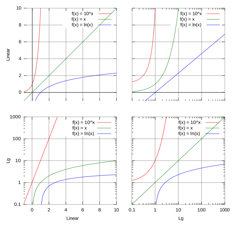
A logarithmic curve rises steeply at first, then levels off and grows very slowly. It is the mirror image of exponential growth reflected across the line y = x.
MCAT examples:
- Enzyme kinetics (v vs. [S] at low substrate looks logarithmic before saturating)
- Sound perception (perceived loudness vs. actual intensity)
- Weber-Fechner Law in psychology (perceived stimulus vs. actual stimulus)
Sigmoidal (S-Shaped) Curves
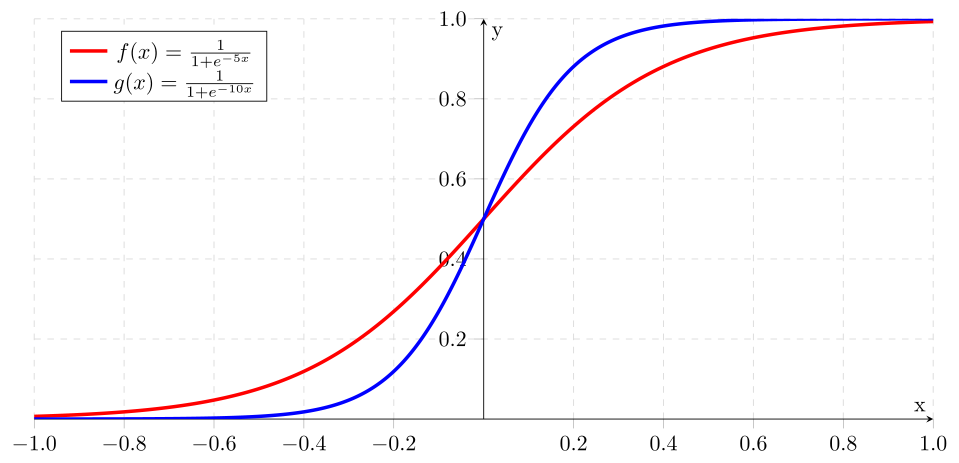
An S-curve has three phases: a slow start, a steep middle transition, and a plateau.
MCAT examples:
- Hemoglobin-oxygen dissociation curve (the most tested graph in MCAT biology)
- Logistic population growth
- Drug dose-response curves
- Titration curves near the equivalence point
The steep middle region indicates high sensitivity - small changes in the x-variable produce large changes in the y-variable. For hemoglobin, this means that in the range of pO2 found in tissues, small drops in oxygen tension cause hemoglobin to release large amounts of oxygen.
Inverse Graphs: y = k/x
A hyperbola that approaches both axes but never touches them. As x increases, y decreases - but never reaches zero.
MCAT examples:
- Boyle’s Law: P vs. V at constant T
- Michaelis-Menten: plotting 1/v vs. 1/[S] (Lineweaver-Burk) linearizes this
Slope: Rate of Change
The slope at any point on a curve tells you the instantaneous rate of change. For a straight line, slope is constant everywhere. For a curve, slope varies - it is the tangent line at that point.
Key principles:
- Positive slope: y increases as x increases
- Negative slope: y decreases as x increases
- Zero slope: y is not changing (plateau or maximum/minimum)
- Steeper slope: faster rate of change
Area Under the Curve: Accumulated Quantity
The area between the curve and the x-axis represents the total accumulated quantity.
MCAT examples:
- Area under a velocity-time graph = displacement
- Area under a force-displacement graph = work
- Area under a power-time graph = energy
- Area under a force-time graph = impulse